There was a discussion on Discord today about faster-than-light travel and what it would actually look like out the window. Someone dropped in an AI-generated video of it, which was, and I say this with love, downright awful. Streaky blue tunnel, the usual. That is the science fiction version, and it has been the science fiction version since the eighties, but it is not what the physics papers actually describe.
So I got curious. Not about whether warp drives are real, they are not, the Alcubierre metric needs exotic matter and is a mathematical solution rather than an engineering proposal. I was curious about the narrower question. If you took the maths seriously and rendered it, what would a star field look like from inside the bubble? And it turns out somebody did exactly that, properly, fifteen years ago.
The paper is Detailed study of null and time-like geodesics in the Alcubierre Warp spacetime by Thomas Müller and Daniel Weiskopf, from the Visualisation Institute at the University of Stuttgart, published 2011. It is aimed at graduate students who have done one course in general relativity, so it is readable if you are willing to skip the parts you do not follow. They work out the paths light takes near a warp bubble, the frequency shift, and the lensing, and then they actually render it, including an interactive Java application that flies you through the Hipparcos star catalogue.
I had a fairly quiet day otherwise, a couple of bug fixes, so I had some spare time and some spare inference. EF-Map already has a fly-through mode that flies the camera along a spline through the star map for video backgrounds. That felt like the obvious place to put it.
What the paper says you would see
The short version, for an observer sitting in the middle of the bubble looking out.
Ahead of you, the stars get pulled in toward the direction of travel. This is aberration, the same effect you get in special relativity, but the paper is specific that the forward distortion is softer than the special relativistic version. You get a slight blueshift and a slight brightening, and that is about it. Directly to the side, at ninety degrees to travel, nothing happens at all. No aberration, no frequency shift, at any speed. That is one of the few things the paper pins down analytically rather than numerically, and it turns out to be really useful when you are trying to approximate it.
Behind you is where it gets interesting. The rear gets a much stronger redshift and heavy demagnification, both by many orders of magnitude, and at superluminal speeds there is an apparent horizon back there. But, and this is the bit I did not expect, it is not a clean black disc. Light from other directions still maps into those viewing angles, so the rear does not punch a sharp hole in the sky the way a black hole does. It just goes very, very dark. The paper's own summary puts it as the strong redshift and the large attenuation letting the rear side appear very dark, which is a nicely careful way of saying it.
And the stars stay points. That is the thing the science fiction version gets most wrong. The paper is explicit about it, in contrast to the elongated stars shown in science fiction movies, stars keep their point-like shape. No streaks. The whole reason they built the Java application was to show people that.
The first problem: EF-Map is far too fast
Here is where the honest compromises start.
Fly-through mode reports its speed in light years per second, because that is a unit that makes sense for a map whose longest axis is about 14,500 light years. One light year per second is about 31.6 million times the speed of light. The fly-through speed slider runs from 12 up to 3,600 light years per second, so the coordinate speeds involved are somewhere between roughly 380 million and 114 billion times c.
The paper's plots stop at 9c.
There is a specific reason for that number, and it is not that they got bored. Their renderer uses a precomputed lookup table, 4096 by 248 entries, and the velocity of each row is given by v = 10^((row + 1) / 248) - 1. Row zero is about 0.0093c. Row 247, the last one, is exactly 9c. Their figures 4, 5 and 6 compare 0.5c, 1c, 2c and 9c. So 9c is the top of everything they actually calculated.
Feeding EF-Map's real number into an approximation built on that range would be meaningless. Every term saturates instantly and you get a flat featureless wall, which is arguably worse than the AI video. The other direction does not work either. I cannot just slow the map down to 9c either, because at 9c a trip across the long axis of the map takes about 1,600 years, and nobody is watching that fly-through.
So the speed shown in the panel and the speed driving the effect are deliberately two different numbers. The live reading gets compressed logarithmically onto the paper's 0.5c to 9c band, and that compressed value, which I have called the visual reference speed everywhere in the app so nobody mistakes it for anything else, is what drives the distortion. The speed readout itself never changes.
| EF-Map speed | Literal coordinate speed | Visual reference used |
|---|---|---|
| 12 LY/s | 379 million c | 0.5c |
| 50 LY/s | 1.58 billion c | 2.6c |
| 100 LY/s | 3.16 billion c | 3.7c |
| 200 LY/s | 6.31 billion c | 4.7c |
| 500 LY/s | 15.8 billion c | 6.1c |
| 1,000 LY/s | 31.6 billion c | 7.1c |
| 3,600 LY/s | 114 billion c | 9.0c |
The logarithm is doing real work there. A linear map would leave every ordinary fly-through setting bunched at the very bottom of the paper's range, and you would never see the effect change. This way the middle of the speed slider, which is where people actually fly, sits around 3c to 5c, which is the part of the paper's range where the numbers are moving fastest.
The second problem: they ray trace it, I cannot
The paper integrates null geodesics backwards from the observer, parallel-transports the Sachs basis along each ray, integrates the Jacobi fields, and from all that gets the apparent direction, frequency shift and magnification for each source. Then it bakes the results into that lookup table so the interactive version does not have to redo the integration.
EF-Map has 24,018 stars, plus a glow layer, a flare layer and about 14,000 gate line segments, and it needs to draw all of it sixty times a second in a browser. Running geodesic integration per star per frame is not happening. Even loading their table is not really the answer, because it is computed for their bubble parameters and their observer, not mine.
So what I built is a closed-form surrogate. It is chosen to land on the same fixed points the paper establishes and to behave the same way qualitatively, and it runs entirely in the vertex shader so the star positions in memory never change. Turn it off and every star is exactly where it was.
For each star, with n the direction from camera to star and axis the current direction of travel, take mu = dot(n, axis), which is the cosine of the source angle. One is dead ahead, zero is sideways, minus one is behind. The angle is theta = acos(mu), and the remap is this.
theta' = theta - 0.5 * k * sin(2 * theta)That is the whole angular distortion, with a weak k in the forward hemisphere and a stronger one behind. I picked it because of what it does at the edges. It leaves zero degrees exactly alone, it leaves ninety degrees exactly alone, and it leaves a hundred and eighty degrees exactly alone. The ninety degree one matters most, because that is the neutral direction the paper pins down analytically, so the approximation agrees with the source exactly at the one place the source is exact. Its derivative is 1 - k * cos(2 * theta), so as long as k stays below one it is strictly monotonic, which means it can never fold the star field back over itself. Stars cannot cross each other, and there is no setting that produces a mess.
Brightness is a similar shape.
front = max(mu, 0)
rear  = max(-mu, 0)
brightness = (1 + frontMag * front^2) * exp(-rearDark * rear^2)
Forward magnification is capped low on purpose, it tops out at about 1.65 times dead ahead. Rear attenuation is exponential and gets to roughly 0.0005 at full strength. That asymmetry is the point, and it is the same asymmetry you see in the paper's figures 5 and 6, where the rear carries orders of magnitude of redshift and dimming while the forward side barely moves.
Colour is the weakest part of the approximation and I want to be straight about that. The paper does it properly, spectrally. Every star gets a Planck spectrum, the frequency shift is applied as a change of temperature, and the shifted temperature is then mapped back to a colour. EF-Map does none of that. It multiplies RGB by a fixed cool bias ahead and a warm bias behind. It is an illustration of their result, not their method. What saves it from being misleading is that attenuation dominates behind, so heavily redshifted stars fade out rather than piling up into a bright red wall, which is roughly the right outcome by a completely different route.
The bit I went back and forth on
The map draws stargate connection lines between systems. They are synthetic, they are user interface, they are not light arriving from anywhere.
I built it first with the gate network tinted along with everything else, then talked myself out of it and stripped the colour shift off the gate lines, on the grounds that it implies they emit light. Then I looked at it and the scene had gone incoherent. The stars were shifting and this web of grey lines sat on top of them not shifting, and it read like a rendering bug rather than a principled distinction. So the tint went back on. The gate lines follow their endpoints' apparent positions, dim with direction, and take the same colour shift, which is a deliberate choice for visual coherence in an experimental mode, and I would rather say that out loud than have it look broken.
One thing I did notice tuning it, the gate lines take colour far harder than the stars do. They start out near-neutral grey, so a multiplier swings them freely, while stars carry saturated warm colours that resist it. At one point the synthetic geometry was shifting nearly two and a half times more than the actual starlight, which felt backwards, and the star tint had to come up to compensate.
What it does not do
No geodesic integration at runtime, no Jacobi fields, none of the paper's lookup table, no spectral or Planck remapping, no exact horizons, no caustics or multiple images, no external observer view, you are always on the bridge. Gate segments are drawn straight between transformed endpoints rather than bent along a light path. The procedural nebula backdrop is faded out rather than optically distorted, because it is a camera-locked sky dome with no shared vertex path and distorting it properly would have meant rewriting the whole nebula renderer for one experimental toggle. Route lines and halo overlays that cannot follow the transform get hidden while it runs.
It is grounded in the qualitative results and the fixed points of the paper. It is not a numerical reproduction of their ray tracer, and I would not want anyone quoting a frame of it as a prediction.
All of that is written up in the app as well. Open fly-through mode, hit the question mark on the panel, and the help section has the mappings, the formulas and the same list of limitations, split into subsections so you can skip to the maths if that is what you are after.
Was it worth doing
Part of this was curiosity about whether it could be done in a sensible amount of time. All in, including the tuning passes and me sending it back twice because the effect was too subtle to see and then once because I had misread my own feedback and made it too subtle again, it was about four hours of Opus 5 and some back and forth on prompts. I have written before about what that workflow actually looks like, and this is a decent example of the kind of thing it is good for. Bounded, well specified by an external document, and easy to check by looking at it.
It also gave me a proper appreciation for how much the science fiction version has shaped what people expect. Nearly everyone in that Discord thread, me included, pictured streaks. The actual paper says points, and gives you a much stranger picture, dark behind, gently compressed ahead, and completely normal out of the side window.
It is live now, in fly-through mode under Camera Settings, off by default because it is experimental and it is not what most people open the map for. The Side to Side preset shows it best. Any questions about the maths or the compromises, or if you spot something I have got wrong in the approximation, let me know and I will get it fixed.
Update, later the same day: I ran their actual application
After posting this it dawned on me that the paper does not just describe the result, it ships the thing. There is a Java application called JRelStarFlight that flies you through the Hipparcos catalogue at warp, and I had glanced at that line in section 4 and skipped straight past it. I should have gone looking for it first. The download is still up on Stuttgart's project page, sixteen megabytes, and it does still run.
Getting it going took a bit. It is a 2011 Java 6 build against JOGL 1.x, so it needs a 64-bit Java 8, because anything newer has removed the internals it leans on. There is also a genuine bug waiting for you. Their shader class asks the driver for the compile log, modern drivers hand back an empty one when the shader compiled cleanly, and the OpenGL binding then throws on the zero-length array. That kills the GL init before anything draws, so on a current machine you get a stack trace and an empty window. Fifteen years ago drivers returned something in that log and it never fired. One guard for an empty log and it comes straight up.
So here is theirs, at the three speeds, pinhole camera, all from the same starting view. The velocity box in the bottom bar is the real control, in multiples of c.
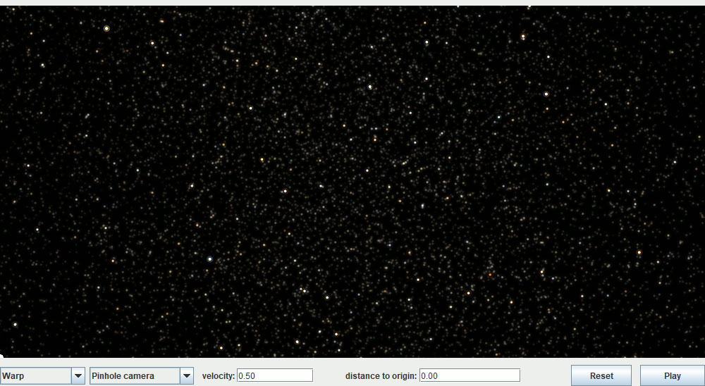
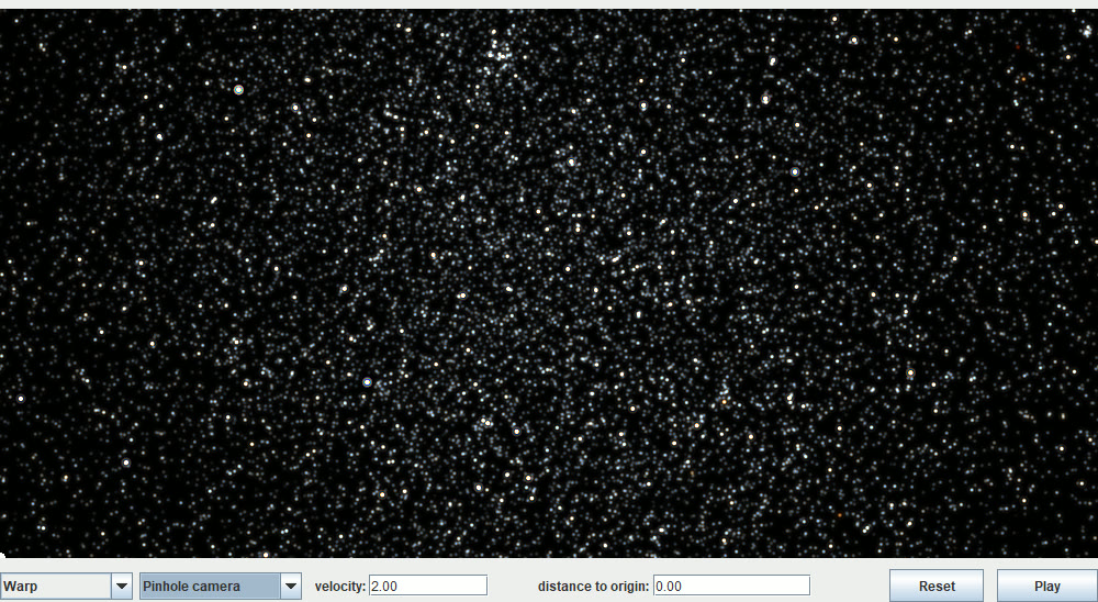
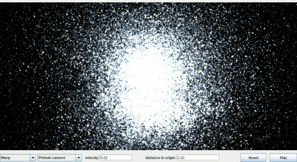
One thing to hold in mind before comparing those to EF-Map. It is not quite the same experiment. Their observer sits still inside the bubble looking at 118,205 stars that are effectively pinned on a distant sphere, so the whole sky funnels into the forward cone. EF-Map's camera is flying through a volume it is inside of, with stars at every distance around it. Ours structurally cannot produce that one bright disc, and that is a difference in the setup rather than a fault in the approximation.
The useful part was in the data folder
The download also contains warpDistort_max9.bin, and that turned out to be worth far more than the application. It is the actual precomputed lookup table from section 4.3, twelve megabytes of it, and the app confirms the shape on startup: 4096 by 248 by 3. Apparent angle, frequency shift and magnification, for 4096 source angles across 248 velocity rows. In other words, the ground truth this whole exercise was approximating, sitting on disk.
So I checked our surrogate against it, and the news was mixed. The 90 degree fixed point came out at exactly 90.0 against their 90.0 at every velocity in the table, which was reassuring since the entire approximation is built on that one anchor. Low speeds were close too. But at the top of the range we were far too gentle. At 9c a star sitting 60 degrees off the axis should appear at 30.9 degrees and we were drawing it at 47.6.
Worse, it turned out our shape could not be tuned into agreement at all. Fitting the single sin(2θ) term angle by angle against their curve demands a coefficient rising to 3.5, and anything above 1 makes the mapping non-monotonic, which folds the star field back through itself. The function was not merely mistuned, it was the wrong family.
The fix was more harmonics. Every sin(2nθ) vanishes at 0, 90 and 180 degrees, so adding sin(4θ) and sin(6θ) keeps all three fixed points exact no matter what the coefficients do, which was the property worth protecting. Three terms, least-squares fitted to their table across its whole velocity range, and the forward hemisphere now lands within about four degrees at 9c where it used to be out by twelve. Peak forward compression went from 14.3 degrees to 31.0, against the paper's own 29.2. I checked the derivative stays positive across the full range at every speed, so it still cannot fold.
| Visual reference | Paper | EF-Map before | EF-Map after |
|---|---|---|---|
| 0.5c | 0.97° | 3.44° | 3.48° |
| 1c | 2.88° | 4.08° | 3.43° |
| 2c | 7.32° | 5.34° | 7.51° |
| 4c | 15.44° | 7.90° | 15.89° |
| 6c | 22.01° | 10.51° | 23.25° |
| 9c | 29.19° | 14.32° | 30.97° |
The one place we now deliberately disagree with the paper is the very bottom of the range. Their forward shift at 0.5c is 0.97 degrees, which against a field of point stars is simply invisible, and an earlier version of this feature was rejected in review for exactly that reason. So EF-Map holds a floor at the low end and lets the fitted curve take over from about 1.1c upward. Given that the speed axis is an invented compression in the first place, keeping the bottom of it legible seemed the lesser sin. It is written up in the help panel rather than hidden.
I also had one claim wrong in the original version of this article's help text, which the table caught. I had said the 90 degree direction is completely neutral. The no-displacement and no-frequency-shift parts are right and are the paper's own analytic result, but I had also claimed no brightness change, and their magnification at 90 degrees climbs to about 4.6 times at 9c. EF-Map still leaves brightness alone there, so that is now described as our simplification rather than as something the paper says.
None of this makes the mode a simulation. It is still a closed-form stand-in for a calculation we cannot afford to run, and everything in the limitations section above still applies. It is just that the forward angles are now fitted to their numbers rather than to my eye, which is a better place to be. If you had already looked at this before today, it is worth another go at the higher speeds, because that is where it changed most.
Related Posts
- Cinematic Mode and the interstellar medium - the other place EF-Map renders physics it cannot afford to simulate properly.
- Bloom, fill rate and 24,000 stars - why the star field is built the way it is, and what it costs per frame.
- The jump range bubble shader - another case of picking an analytic approximation because the real optics were too expensive.
- Three apps in one day - the agent workflow that built this in an afternoon.