I was discussing something else entirely when ChatGPT GPT-5.6 Sol gave EF-Map's interface roughly 6 out of 10 for general polish. The question was whether the site looked credible enough to support a small sponsor placement. Its answer was that the 3D map no longer looked like a basic hobby project, but the controls around it still looked like a sophisticated community tool assembled one feature at a time. That was unsolicited. It was also broadly fair, so my response was basically: okay, what would move it nearer an 8 without redesigning the thing people already know how to use?
EF-Map had been growing for about 12 months. A new panel needed a button, so the button went where it made sense. A status needed showing, so it found an empty bit of perimeter. Each decision was defensible when it happened. Put them all on screen together, though, and there were several slightly different ideas about height, spacing, selection, window state and importance. Nothing was catastrophically wrong. The shell just did not quite look as though one person had designed it at one time, because obviously they had not.
The difference between controls and a system
The old interface had individually useful parts but not enough shared grammar. Similar controls were a few pixels different in height. The top-left commands, Live Events ticker and top-right actions followed different vertical rhythms. The feature rail was a stack of boxed cards, while the panels beside it began from a slightly different point. At the bottom, Hide UI, news, the Helper and Shoutbox looked like separate additions. Open several panels and several rail buttons could all look fully selected, even though only one window was actually at the front.
The panel chrome had the same problem in miniature. Help, minimize and close controls had accumulated slightly different shapes and weights. Tabs inside one tool could feel unrelated to tabs inside another. Routing and Leaderboards were good examples because they exposed enough controls for every inconsistency to become visible at once. The earlier feature bar and scaling work had solved real interaction problems, but it also showed how much UI change can fit into 12 months of an actively developed tool.
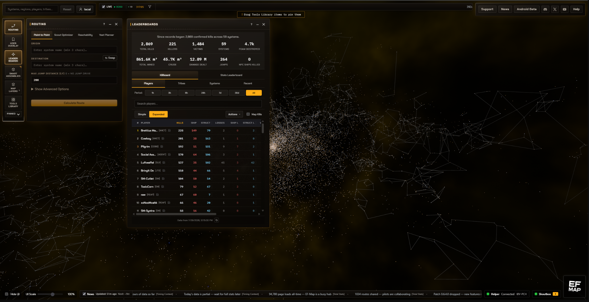
The constraint was not to redesign EF-Map
I did not want a clean-sheet design. The 3D EVE Frontier map had to stay. Existing feature locations, one-click actions, labels, icons, pinned tools and user customisation had to stay. Panels still needed to drag, resize and minimise. People had already built muscle memory around the rail, so moving everything into a fashionable command palette would have improved a screenshot while making the application worse.
That became the useful constraint. A successful version should look immediately familiar. The silhouette should remain EF-Map, including its fairly dense specialist identity. The work was about making the existing decisions agree with each other, not sanding the application down into a generic software dashboard.
Giving the shell one rhythm
The first pass treated the perimeter as an application shell rather than a collection of floating boxes. It standardised the interface typography around Chakra Petch and IBM Plex Mono, continuing the visual system described in the EF-Map identity overhaul. It then introduced shared shell values instead of letting each module invent its own. Ordinary top controls now use one 32-pixel measured height. Perimeter modules share a 10-pixel inset and external gap. Reset and Connect line up with Support, News, Android Beta and Help.
The Discord, X and YouTube links still work as three one-click destinations, but they now sit in one segmented group with the same outer height as its neighbours. Each icon fills that height without a second vertical inset. The Live Events ticker remains its own shorter surface, aligned to the shell instead of being inflated just to satisfy a row. At the bottom, Hide UI, the news ticker and the operational controls share a 32-pixel rhythm. The compass logo stays taller because it is a branded anchor, not an ordinary button pretending otherwise.
UI Scale also moved into Display Settings as the durable control. It can still be enabled as a quick footer action, but it no longer has to occupy permanent space for every visitor. That sounds like a small housekeeping decision, and it is. Enough of those decisions together are what make the shell feel intentional.
Turning the feature rail into an instrument dock
The biggest visible change is on the left. The old feature rail treated every item as a small independent card with its own border, gradient and shadow. The replacement is one continuous instrument dock. Existing icons, labels, order, drag behaviour and clicks remain, but resting segments no longer compete with the map or each other.
The more important change is state. A panel can be closed, open behind another window, minimised, or frontmost. Those are different facts, so the dock now shows them differently. Only one non-minimised panel receives the full frontmost treatment. An open background panel gets a quiet near-full-height line in a shared three-pixel left gutter. A minimised panel gets a shorter line lower in the same gutter. A closed tool gets no permanent marker. Switches and map toggles use a separate active treatment because a switch is not a window.
This made the dock more useful, not just quieter. I can glance at it and tell which window will be under the others, which one is hidden, and which one I am actually working in. Pinned tools keep normal prominence. Display Settings is not dimmed to imply it is less legitimate than the main features. The resize interaction for the Pinned section still has a forgiving 28-pixel target, but the thing drawn on screen is now a restrained 22-pixel grip rather than a bright curved underline across the rail.
The Map Layers flyout needed its own correction after the main dock was finished. It had retained the old boxed appearance and looked like a bit of the previous UI had escaped the cleanup. It now uses the same surface, typography and control treatment as the dock while remaining a secondary flyout. Matching a system does not mean forcing every surface into the same shape.
Panels that start and behave together
Fresh desktop panels now share one canonical content origin beside the dock. That removed the odd first-open offsets where a panel appeared a few pixels above or below its neighbour. Panel surfaces and shadows were brought into one family, and standard drawer headers use a 42-pixel minimum height. Titles use the same uppercase treatment and accent keyline. Help, minimise and close controls share dimensions, borders, hover behaviour and focus treatment.
The changes continue inside the panels. Tabs have a clearer current state. Nested tabs use the same logic at a lower level instead of becoming a different component visually. Inputs, focus rings and primary actions are more consistent. Routing is a useful example because its origin and destination fields, route modes, results and actions now sit inside chrome that has one obvious hierarchy. Leaderboards shows the other side of it: a dense panel can still be dense, but its header, controls and table no longer fight for equal attention.
Some of this work depended on earlier structural changes. The App.tsx decomposition had already moved large parts of the interface out of a nearly 20,000-line file, which made it safer to change shared shell behaviour without adding another block to the monolith. The visual pass was not a refactor project, but it benefited from one.
The Tools Library stayed a grid
The Tools Library could not simply become borderless. Its tiles are draggable tools, internal panels and external applications, so boundaries carry real information. The solution was to quieten the tiles rather than erase them. Resting tiles now use flatter, lower-contrast surfaces. Internal EF-Map panels can reuse the dock's open, frontmost and minimised grammar. An external application does not claim to be an open EF-Map window just because it lives in the same library.
This was a useful test for the design language. Consistency does not mean that a dock, a draggable palette and a panel tab should be visually identical. It means the same state has the same meaning, accents carry the same importance, and different components still look as though they belong to one product.
The bottom dock and the UI that gets out of the way
Hide UI now reads as a proper mode control, with Show UI providing the return path. News aligns to the same baseline. Helper and Shoutbox form one segmented operational group rather than two unrelated pills. The taller logo remains separate and bottom aligned. Again, none of this adds a feature. It removes several tiny questions about whether adjacent things are related.
The rotating tips pill needed more than paint. It can be moved by a long press, so a stored manual position still has to be respected. It also sits in the same space as Help, floating panels and narrow layouts. The final behaviour measures those obstacles. If the pill would cover something important, it fades without moving the window or rewriting the saved position. Rotation and announcements pause while it is hidden. Once the area stays clear for a short delay, the pill resumes where it was. An unsafe manual drop returns to the latest safe point instead of saving the collision.
This is probably the least visible part of the whole job, which is a good result. Coaching UI should be useful when there is room and absent when the user is trying to operate the application.
The work underneath the polish
The implementation added shared shell spacing and control-height tokens, a canonical desktop content position, and explicit typed panel states used by both the dock and Tools Library. Collision detection watches rendered panel rectangles rather than guessing from fixed coordinates. Theme accents, custom Ember hues, Work Safe Mode and reduced motion remain part of the contract. Existing preferences and saved panel positions were preserved.
The browser tests also became more specific. They measure geometry at 50, 75, 100 and 125 percent UI Scale across supported desktop widths, including 3440-pixel displays. They check that top controls retain the same height through hover, focus, unread and open-popover states, and that the social segments do not grow their wrapper. Separate tests cover dock state, the Pinned grip, panel origins, tips collisions and safe dragging. A test can prove that two rectangles line up. It cannot prove the result looks good.
The review loop mattered more than the first pass
I used GPT-5.6 Sol in a ChatGPT web conversation as the product reviewer, architecture sounding board and prompt writer. GPT-5.6 Sol inside VS Code then worked against the real repository as the implementation agent. I had mainly spent the previous month using Anthropic models and Fable 5, but I had several weekly Sol resets available and wanted to give it a substantial task instead of a synthetic comparison. This is not a benchmark claim. It was a useful way to separate product critique from implementation while keeping both grounded in the same screenshots and code.
The loop was simple. I took the critique, generated a scoped implementation brief, made changes on a Git branch, ran Playwright and browser smokes, deployed a Cloudflare Pages preview, and compared production with the preview at full size. Then I described the thing that still looked wrong. That process is similar to the earlier browser-and-repository UX audit work, but this time it covered the whole shell rather than one feature.
Several automated passes were technically correct and visually wrong. The Live Events ticker was initially centred vertically and looked as though it had dropped down. The first background-panel markers appeared on the right and resembled unread badges. Pinned items were dimmed and looked disabled. Display Settings briefly had an awkward pseudo-selected treatment. The Tools Library kept the old glossy cards until a screenshot made the mismatch obvious. Later, the Map Layers flyout and map overlay typography stood out only because the larger inconsistencies had already gone.
Those treatments were removed or revised. That distinction matters. A clean final screenshot can make the process look like one excellent prompt produced one excellent answer. It did not. The useful part was the repeated correction: tests for behaviour, large screenshots for composition, and a human saying that a technically aligned object still looked dropped down.
What did not change
The 3D map was not replaced. Routing, feature workflows, wallet behaviour and Helper protocols were not redesigned. Existing personalisation, pinned tools, panel dragging and resizing remain. The application is still dense because it serves people planning routes, reading activity, managing structures and working with a large EVE Frontier universe. I did not want to hide that complexity behind a homepage-style interface.
This was refinement and systematisation. The hard part was deciding which differences communicated useful state and which ones were merely historical. The map still owns the screen. The shell now does a better job of supporting it.
The result
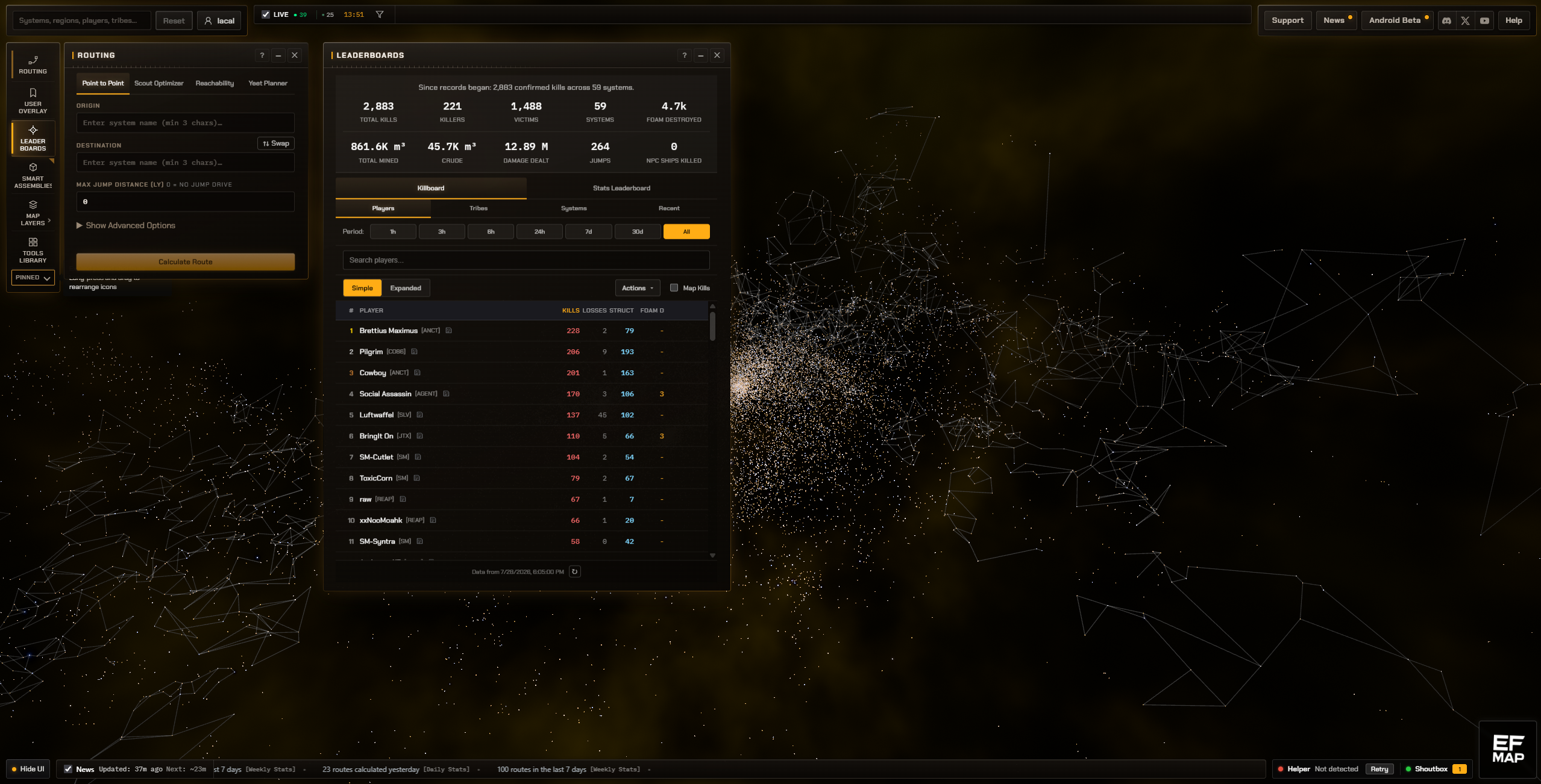
I think the improvement is clearest with several panels open. The interface is not dramatically simpler and it was never meant to be. It is calmer. The frontmost window reads as frontmost, background windows remain discoverable, the perimeter controls line up, and the map gets more room to be the interesting thing.
Whether that moves the subjective score from a 6 to an 8 is not something I can measure honestly. It is still EF-Map, which was the main requirement. The useful lesson for me was that polish came less from spectacle than from hierarchy, state communication, alignment and consistency, followed by enough screenshot review to catch the moments where the system was correct but the result still looked odd. That is where the preview sits at the moment.
Related Posts
Does This Look AI-Generated? Rebuilding EF-Map's Visual Identity with Claude Fable 5 covers the fonts, icon grammar, squared geometry and theme system that this shell pass builds on.
UI Refinements: Feature Bar Evolution, Scaling Consistency, and Storage Panel records an earlier stage of the rail and shows why the current work is an evolution rather than a replacement.
Refactoring a 19,846-Line Monolith with Claude Fable 5 explains the structural cleanup that made shared shell changes safer.
Quick Tour: Interactive Onboarding with Driver.js covers another attempt to teach a dense EVE Frontier tool without removing its depth.