This morning I put out a trailer for EF-Map. It's just over two minutes, no talking, just the bits of the map I think look best. The reason for doing it was simple enough. A lot has changed since the start of Cycle 7, the map is a community-charted one now because of Fog of War, and I wanted something short that showed that off. While I was watching it back, one thing kept catching my eye, and it wasn't anything I'd touched this cycle. It was the extended hover label, the card that opens when you rest your mouse on a star. Next to everything around it, it looked dated.
The trailer
Here it is if you've not seen it. When I recorded it, players had charted 570 systems in two weeks. On top of that it shows routes through the gates, the Trinary's gravity, tribe networks, public catapults and Open Markets, and the killboard. The tribe network, node fuel and Intel scenes use made-up data so nobody's real setup is on show. Everything else is the live site.
It's a promo, not a tutorial, so the hover card is only on screen for a few seconds. That was enough.
What looked out of place
The card has been there since the map went live, and things have been bolted on to it ever since. Live kills, live activity, public structures, marks and their tasks, and this cycle the readings players report when they submit a system's details. It does its job well. It also uses colour to carry a lot of information. The star is tinted by its spectral class, each planet type has its own colour, transient mass is gold, infestation is red and gravity turns orange when it's high enough to strain your Rider. I like that, and it was the one thing I definitely wanted to keep.
The rest of the interface had its going over just before the cycle started. That's the Cinder theme, and the windows, the menus and the right-click menu all got the same warm black glass and thin frames. The card didn't. It still had the cool blue-grey frame from before, its faded lines were a cool grey, and the planet count was pure white. That last one is because the planet count used to be tinted by a system's external temperature, and this cycle there isn't one, so it fell back to white and ended up brighter than the system name.
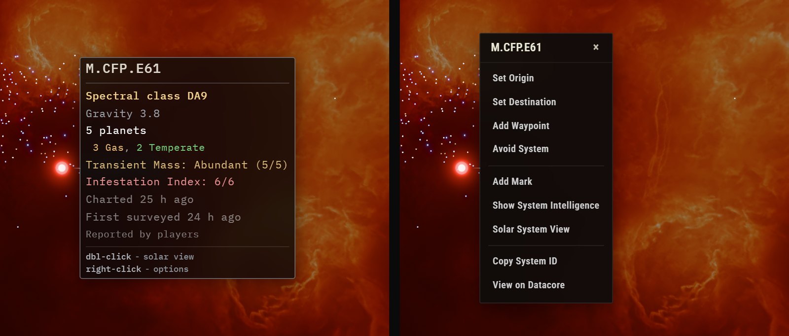
The fonts were the other thing. The card set every line in a monospaced font, words and all. The right-click menu set everything in Roboto Condensed, the system name included. That wasn't by design, it's just how they each grew. My own design notes say names and numbers go in the mono font and words go in the display font, so each of them was half wrong in a different direction, which is probably why they looked unrelated.
The bit that jumped
The second thing I noticed in the video was the card growing after it opened. It opens once you've rested on a star for a second, which is the default. Only then did it ask for the planet types, which in Fog of War come from the system details players have submitted. That request takes about 300 milliseconds. When the answer came back, the whole card was thrown away and built again with an extra line, so it went from 232 to 251 pixels tall. The card sits centred on its star, so the top jumped up 9 pixels and everything under the planet count moved down a line.
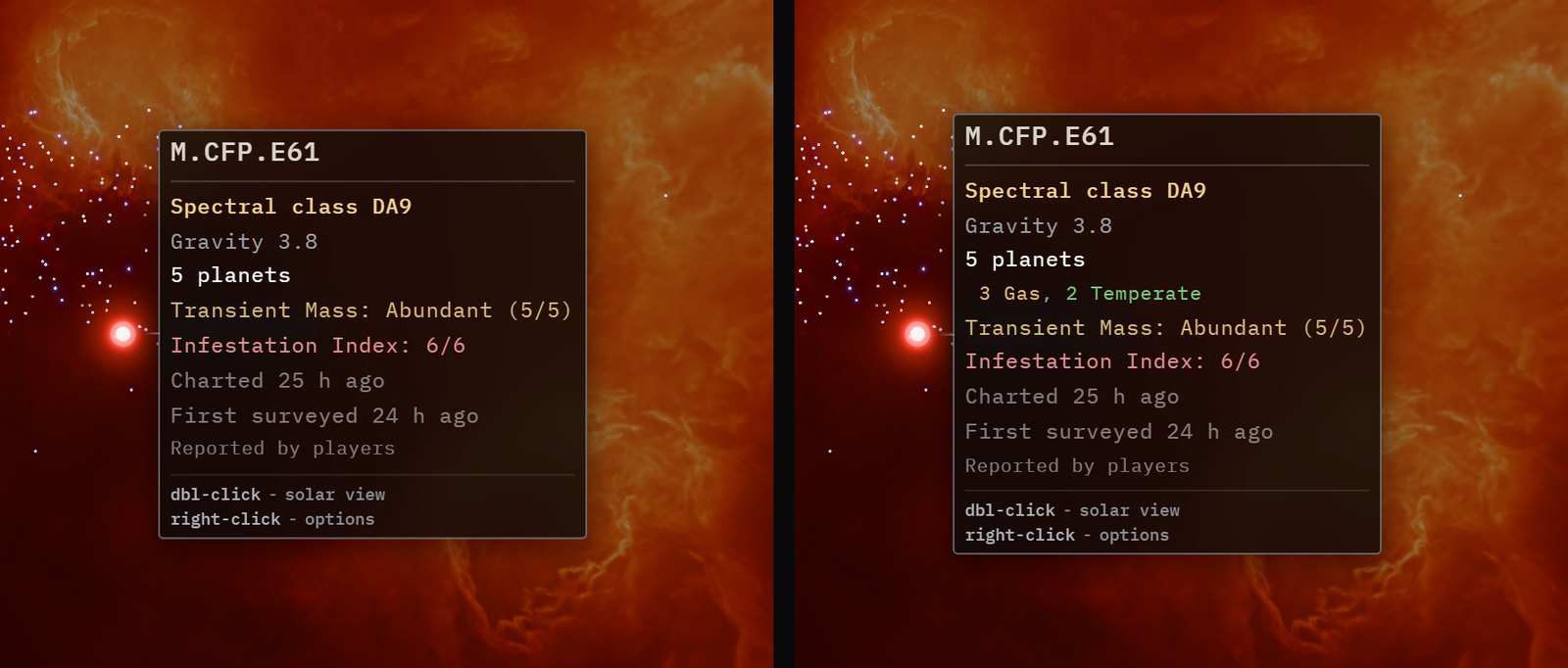
It wasn't enough for me to hold the video back. EF-Map is a product in active development for a game in alpha, so it is what it is. But once you've seen it, you can't stop seeing it. The fix was to start fetching the planet types as soon as the pointer lands on a star, not when the card opens. The one second wait then hides the request nearly every time. If the connection is slow, a placeholder holds the spot on the planets line and the types fill in where it was, so the card never changes size. I checked that by holding the request back for two and a half seconds. The card opened at 186 pixels with the placeholder, and it was still 186 pixels when the types landed.

How things get left behind
I think this is just what happens when one person builds something continuously. Every new feature gets the attention while I'm building it, and the older parts stay as they were while everything else moves on around them. A company would have people whose whole job is keeping things in line with each other. I don't. I've started building some habits to help, like a project control repo that keeps track of what's going on across all my repos, but it's not a team. Things slip through.
The strange part is that I use this card constantly when I'm playing Frontier. Every time I'm planning a route or checking a system. You just stop seeing it. It took putting a video out and watching it back the way somebody new would for me to notice. Then it was a few hours to bring it in line with the rest of the site. That's the bit I keep relearning. Noticing is the hard part. Fixing it is quick.
Three options
I'm not a UI developer, so rather than guess, I asked the LLM I work with to look at the card properly first. It took screenshots of the live card and the menu, measured the fonts, colours and timings off the page, and put together a review page with mock-ups laid over a real capture of the map, so I could compare them on the same star at the same size. There were three to choose from. Today was the card as it was. Tidy kept the same lines in the same order and just fixed the frame, the colours and the fonts. Readout went further, with small upper-case labels on the left, values in mono on the right, colour on the values only, and meters for transient mass and infestation.
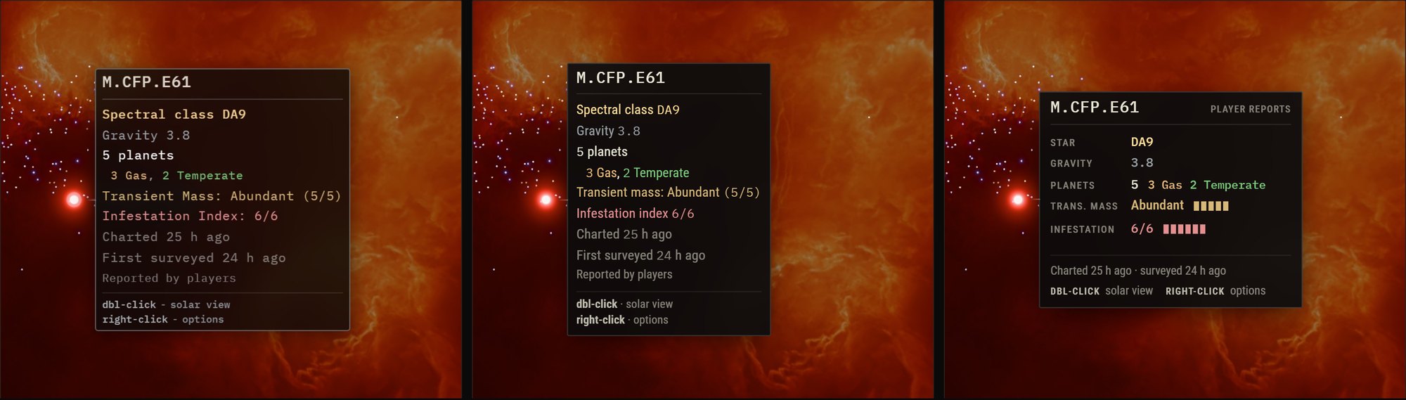
Tidy was a step in the right direction, but I felt Readout was better. I kept the meters. Transient mass and infestation feel like they're staying in this alpha, and a row of five or six blocks is quicker to read at a glance than 5/5. It also isn't a new look for the site. The Fog of War notice already shows its counts that way, the number in mono with a small upper-case word beside it, like 570 CHARTED.
What it looks like now
The card now wears the same frame as the right-click menu, and it fades in the same way, a tenth of a second or so, rather than just appearing. The system name is in the mono font on both, so the menu looks like it grew out of the card. The menu's rows picked up the same warm off-white text as well. I kept the double-click and right-click hints at the bottom of every card, because there are a lot of new players coming in at the moment and it's the easiest way to find out that double-click opens solar system view. The Explorer Cards use the same card underneath, so they got all of this too.
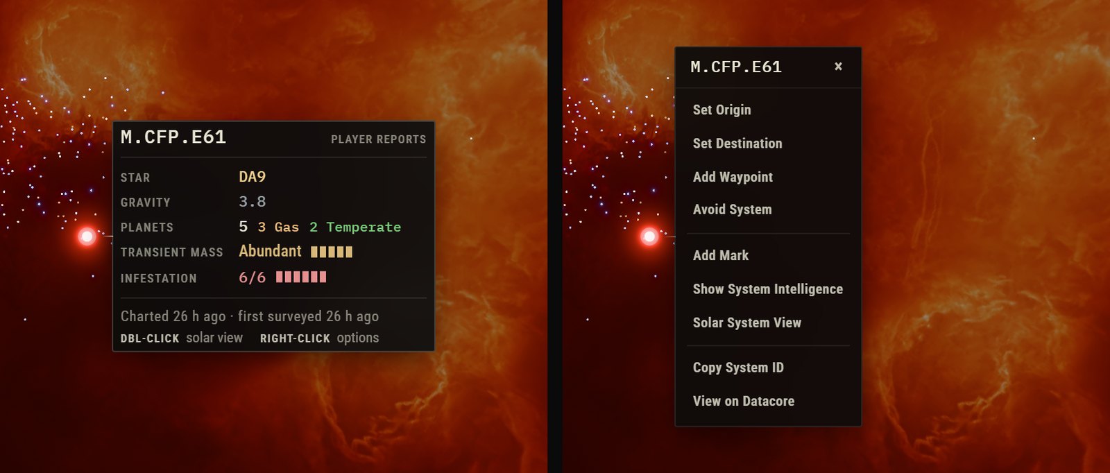
The colours didn't change. The star is still tinted by its class, the planet types are still in their own colours, transient mass is still gold and infestation still red. They just sit on the values now instead of whole lines, so the labels don't compete with them. The chart and survey times went from three lines to one, and the "Player reports" tag went up beside the system name, which says where the readings came from without taking a line.
Busy alliance hubs
The other place the card needed work was User Overlay. When it's open, the card lists every mark on the system, yours, your tribe's and your alliance's. User Overlay users aren't the majority of people on EF-Map, but on a busy alliance hub with half a dozen marks, each with a gate link, a transponder code and a note, the card was getting very long. The worst one I had in front of me ran most of the way down the screen.
So that got condensed. There's one heading per folder now instead of one per mark. With more than one mark, each gets two lines, its gate or catapult link (or its icons), then its transponder code and the start of its note. Long notes get cut off with an ellipsis, but transponder codes never do, because people copy those into the game. A system with a single mark still shows the whole note, and User Overlay always has the full text.
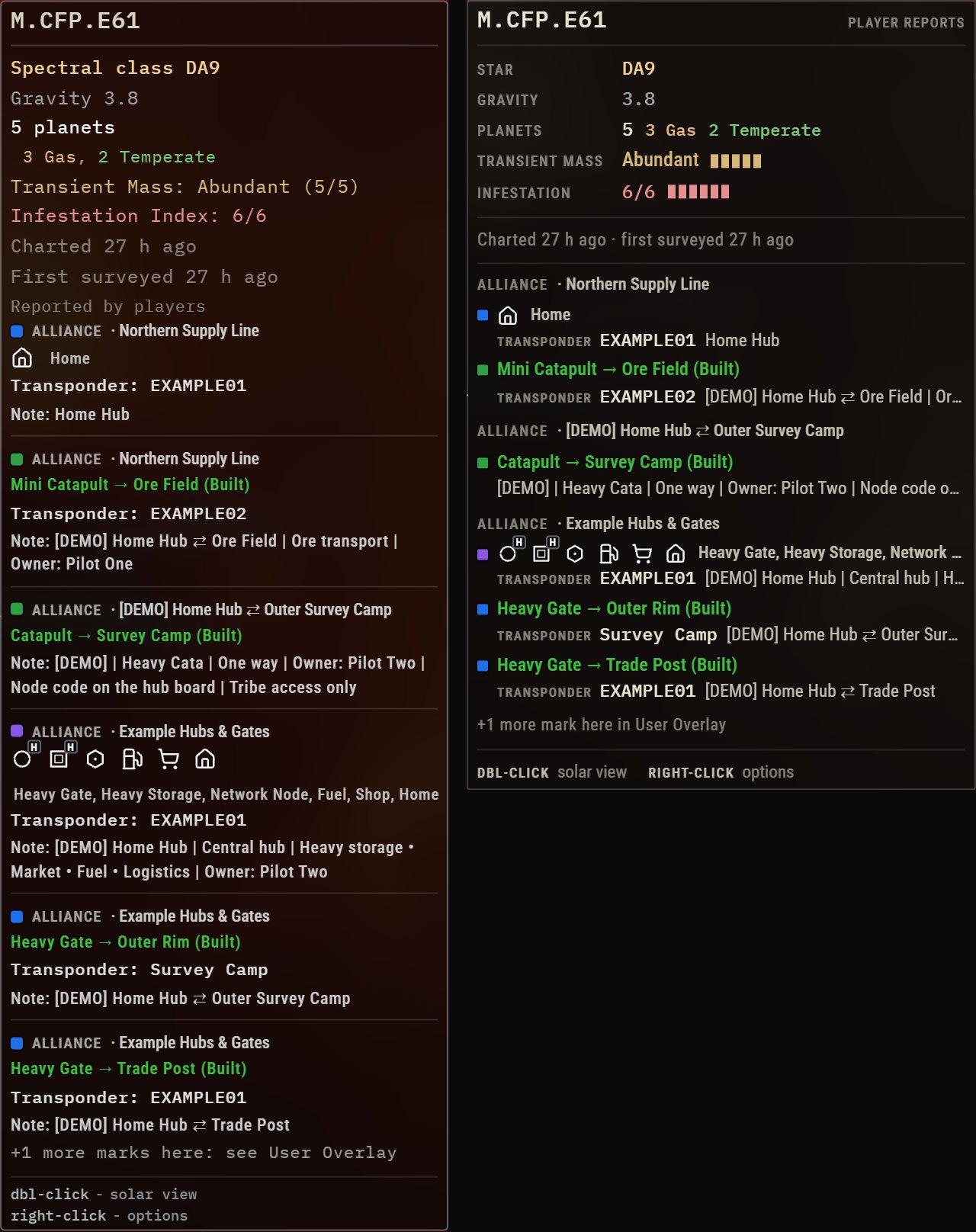
With those seven example marks the old card was 294 by 807 pixels and the new one is 334 by 518. It's a bit wider, because it leaves room for a full 32 character transponder code, and a lot shorter.
The kill plates, while I was at it
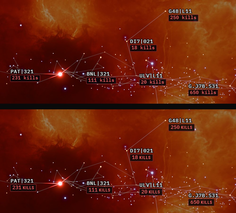
Once the card was done, the kill counts under system names looked off next to it. They were already in the same mono font at the same weight, but the whole line was mono, word included, on a cool blue-black plate. So they got the same treatment. The number stays in mono, the word becomes a small upper-case label, and the plate is the same warm black as the card. The same goes for the other plates, like NEW, SURVEYED, and the recent kill counts.
Before and after, in numbers
| What | Before | After |
|---|---|---|
| Card on its first hover of a surveyed system | Opened, then grew a line about 0.3 s later (232 to 251 px) | Opens complete. With the request held back 2.5 s, 186 px before and after |
| Busy hub, seven example alliance marks | 294 by 807 px | 334 by 518 px |
| System name font, card and right-click menu | Mono on the card, Roboto Condensed in the menu | Mono on both |
| Kill plate under a system name | "231 kills", all mono, blue-black plate | "231 KILLS", mono number with a label, warm plate |
It's all live now. Rest your mouse on any charted star on the live map to see it. If something looks off, or you preferred the old card, let me know and I'll change it.
Related Posts
EF-Map's New Link Styles, and Why the Human Still Has to Be in the Loop is the last time something on the map looked dated next to everything else, and how that got sorted.
EVE Frontier Cycle 7 Fog of War: What It Could Mean for EF-Map is what I wrote before the cycle, when Fog of War had only been announced and I was guessing what it would do to the map.
Cycle 7 Slowed EVE Frontier Down, and EF-Map's Bookmarks Got Busy covers why User Overlay is getting so much attention this cycle.
Does This Look AI-Generated? Rebuilding EF-Map's Visual Identity with Claude Fable 5 is the first time I went back and forth with an LLM on how EF-Map should look.