Last night I asked an LLM to make the catapult and gate links on EF-Map look better. By the time I'd had my breakfast it had built five new versions of them, every one of them had been live at some point, I'd binned two, and the one that's now the default is the quietest of the lot. That's the short version. The longer version is why this post exists, because it's a pattern I keep running into with LLM-assisted development. The LLM is good. It builds what you ask for, it builds it fast, and it checks its own work better than I would. But there are calls it can't make for you, and on this one it took me three goes and a night's sleep to work out what they were.
Where the links came from
If you plan infrastructure in EVE Frontier with EF-Map, you'll know the links. A mark in the User Overlay can carry a catapult or gate link to another system, with its status, Built, In progress or Planned, and the map draws it. That started back in July because my tribe had drawn one of their catapult routes as a chart, by hand, in Discord. This week the same links started showing up in Public Structures, where owners share their revealed structures and each catapult draws an arc to wherever its owner says it throws you. People use them every day now. Tribes plan whole routes with them.
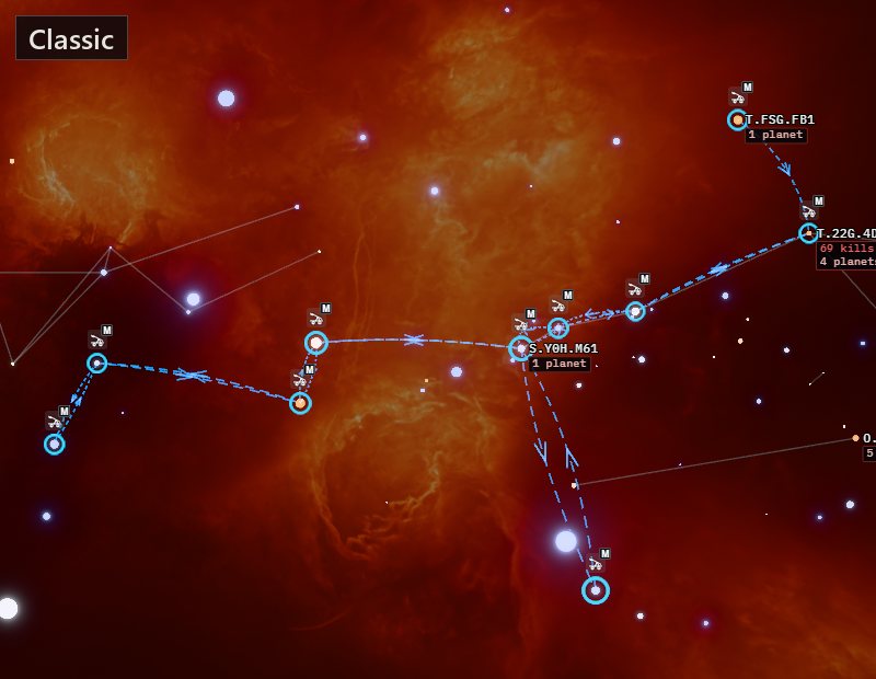
The look had barely changed since July. Thin lines, dashed arcs for catapults, solid lines for gates, a little arrow halfway along each arc. It works. But whenever I had a couple of routes switched on, it looked like somebody had drawn on the map with a pencil, and next to the rest of the map, which has had a lot of visual work this cycle, it looked dated.
The first pass
So I asked for it to look good without losing what it does. It's a tool, so it still has to read as one. Which way a catapult throws you, what's built and what's still a plan. I also gave it the one rule everything on the map gets now, that any animation has to wind down and stop. EF-Map drops to about five frames a second when nobody's touching it, so it can sit on a second monitor while you play without cooking your GPU. And I said that if it had more than one idea, give me a switch.
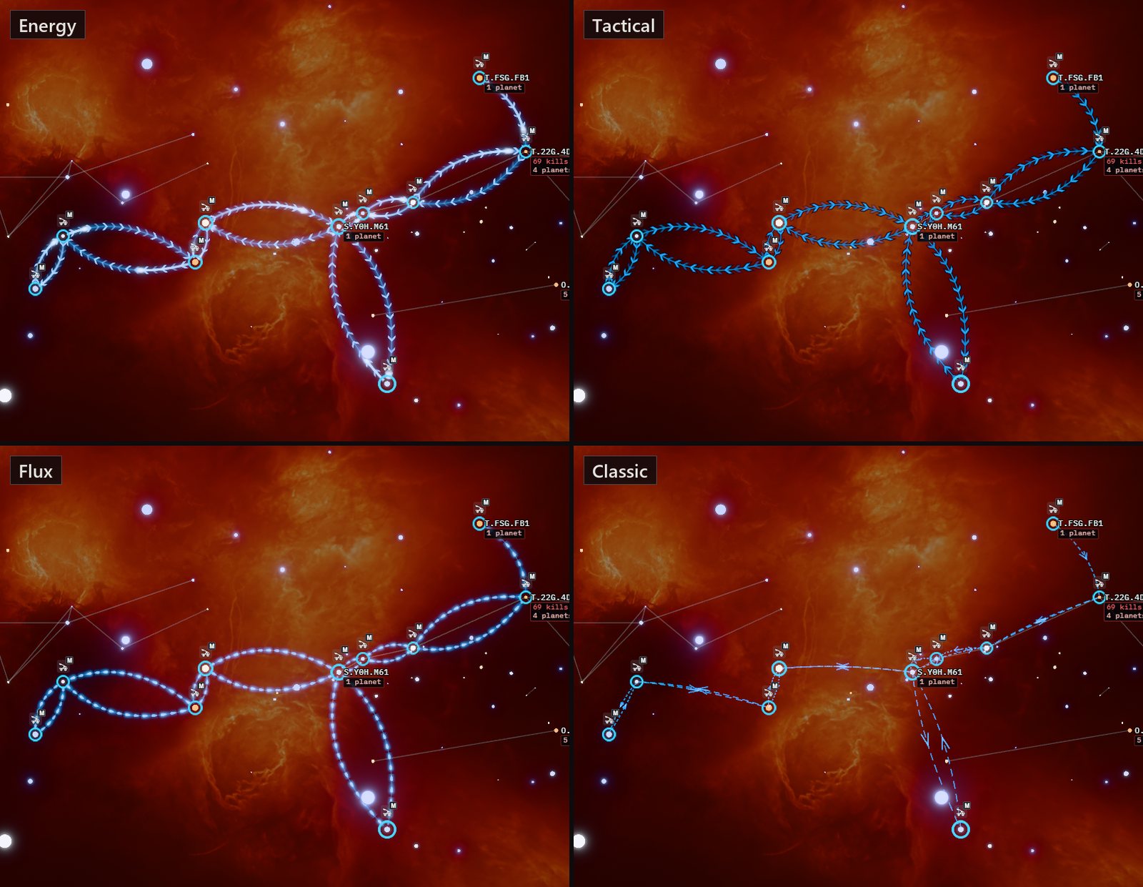
It came back with three new looks beside the original. Energy was glowing lines, chevrons marching toward a catapult's destination, a streak of light now and then like the catapult firing. Tactical was a crisp chart look with dark edges, catapults drawn as chains of arrows and stargates with railway stripes. Flux was streams of beads, with two lanes flowing opposite ways on a gate. Underneath, it swapped the old one-pixel lines for proper ribbons with real thickness, which is how the route ribbon has always been drawn. The movement ran at full speed for five seconds after you touched the map, slowed over the next fifteen and stopped. I measured that on my own machine afterwards, about 10 frames every two seconds at rest, around 150 just after a mouse move, and back to 10 by the 25 second mark. That rule held all the way through.
While I was looking at the first preview, a second agent reviewing the code found two real bugs. If the camera sat between the two ends of a link, the link fanned out across the whole screen. And planned links were creeping along at that five frames a second, which is exactly the stutter the wind-down rule exists to avoid. Both were fixed before anything went near the live site. That's the machine checking the machine, and it's good at it. It finds the things that are wrong.
I asked for it to go live so I could look at it properly on the real map, decided I liked Tactical best, and had that made the default, with the switch added to Public Structures as well, because the only place it lived was the User Overlay menu. That was about four in the morning. Then I went to bed.
Fresh eyes
I woke up, opened the map, and something was bothering me. I couldn't say what. My first guess was the colours. The first player to share his network in Public Structures picked yellow for it, which is fair, he was given the choice. My own route links are green because that's what Built means. Put those through Tactical, with its thick dark-edged lines and arrow blocks marching along them, and the whole thing looked very primary school. The interface around it is transparent and muted. The links were screaming off the page. Ember on a red nebula I could get behind, because it matches. Bright yellow and green just didn't.
I also couldn't find the switch in Public Structures. I'd asked for it, it had been added, and I still didn't see it, because it was a small curve icon beside the refresh button with no label. If I can't find it on my own map, nobody else is going to. So that got a label.
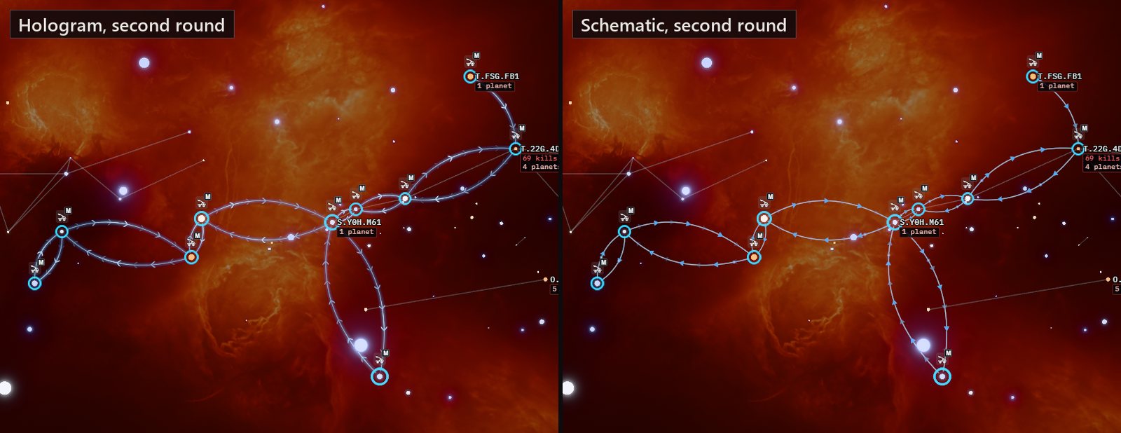
Then I kept Tactical and Classic, because some people will like the bold look and some people are used to the original, and asked for two quieter options in place of Energy and Flux. Hologram is thin and see-through, with the colour softened. Schematic draws the lines in the same light grey as the interface and keeps the colour for small things, the arrowheads along a catapult and the ends of a gate.
The thing I couldn't name
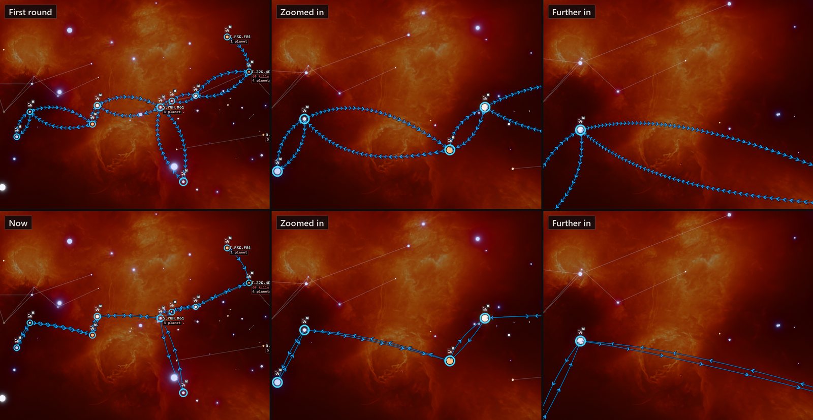
They were better. Still something sat wrong, and it took me playing with them for a while to work out it wasn't the colours at all. It was the arcs. A catapult link and its return leg bow apart so you can see there are two of them. In every new look the bow was worked out on screen, so wherever the camera went, the two legs swung round to face you and you always saw a nice open ellipse. From the LLM's side that makes complete sense. If there's a back and forth, you want to see both curves, all of the time. It's a sensible design decision. It just wasn't the right one.
The reason I say that is the NPC gate lines. When you move the camera and two of them overlap, they overlap. They don't care about you. They're lines drawn in space, and the Classic links behaved the same way, and I think that's what made them feel like infrastructure. Somebody has spent hours in the game building a catapult, then taken the time to plot it on the map. Having it rotate to face the camera like a sticker, and having its arrows multiply every time you zoom in, didn't respect either of those. It felt cheap.
The bow was huge, too. The new arcs bowed out by up to 15% of their length on screen, on each side, so a catapult and its return looked like two different routes through space, when really it's the same route forward and back. Classic bows 12% to one side and 6% up, fixed in place, just enough to show there are two catapults.
So every new look now uses exactly the same arc as Classic, fixed in space. Turn the map side-on and the two legs fold together. The arrows got a ceiling as well. Zoomed out they still thin out, so a route doesn't turn into a smear, but past a certain point zooming in just spreads them apart along the line, like markings painted on it, instead of adding more.
Where it ended up
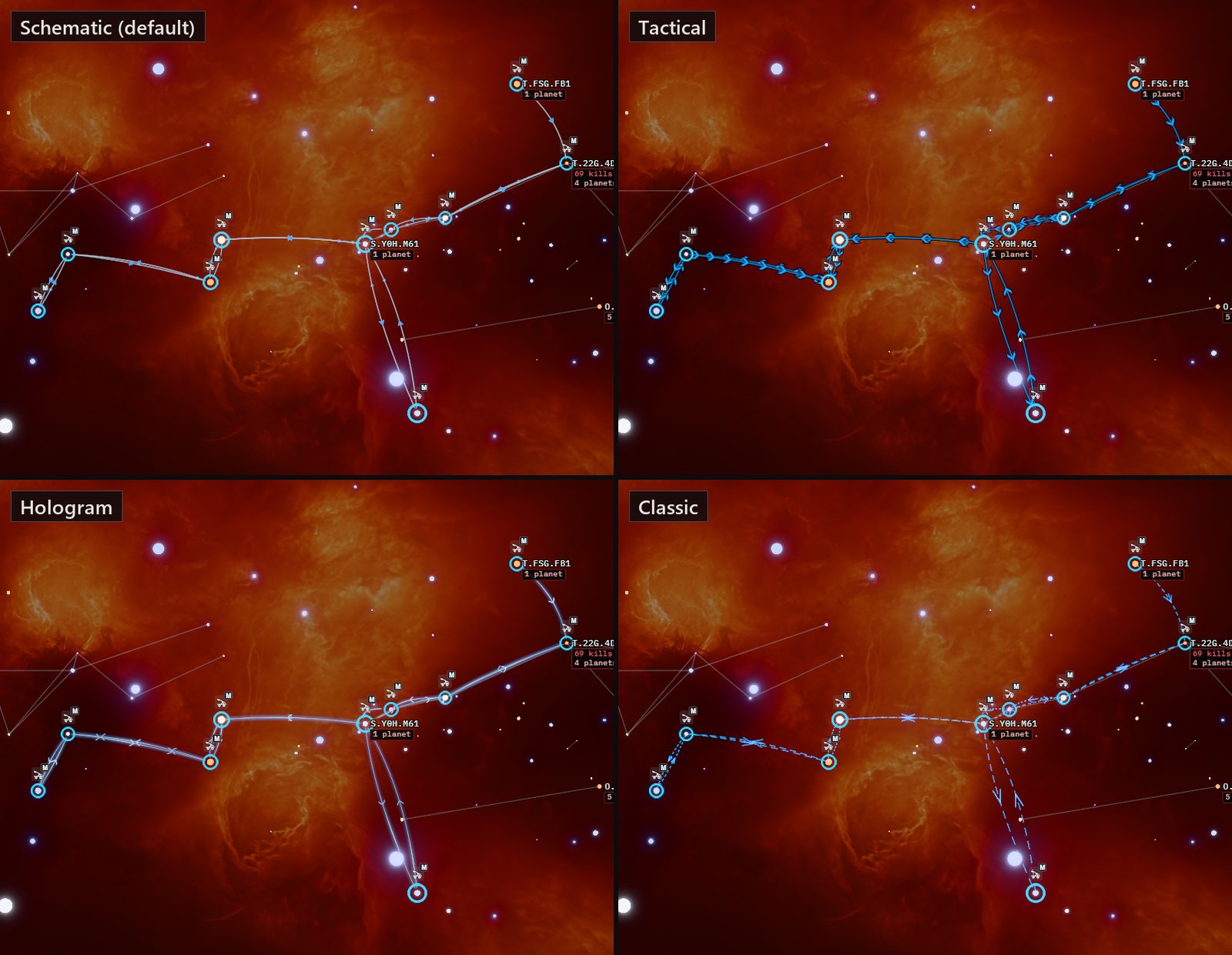
There are four looks now. Schematic is the default. Tactical and Hologram are there if you want more, and Classic is there if you liked it as it was. The motion in all of them only runs for a few seconds after you touch the map, and planned links never move at all. In the quieter looks, in progress links are dashed and planned ones dotted and fainter, and the colour still says the same thing it always did. If you already picked a look it stays picked. Anyone who'd picked Energy or Flux in the few hours they existed gets Schematic.
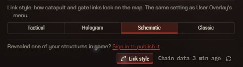
You change it in two places, and they're the same setting. In the User Overlay it's in the menu behind the three dots, under Link style. In Public Structures there's now a Link style button at the bottom of the panel. Public Structures also opens with each owner collapsed to a single line now, because the full list was too much for a first look.
All of this happened on 8 October 2026, and it's all still viewable. Cloudflare keeps every preview build, which is where the older screenshots came from.
| Time (UK, roughly) | What changed | Where |
|---|---|---|
| 2:50am | Energy, Tactical, Flux and Classic, arcs bowed on screen | Preview |
| 3:40am | The two bugs from the code review fixed, then live with Energy as the default | Live |
| 4:00am | Tactical made the default, switch added to Public Structures | Live |
| 8:40am | Hologram and Schematic replace Energy and Flux, labelled button | Preview |
| 9:20am | Arcs fixed in space like Classic, arrows given a ceiling | Preview |
| 9:35am | Schematic made the default, Public Structures owners collapsed | Live |
The human in the loop
I didn't write any of the code in this. I'm a vibe coder, and I couldn't have written the shader if you'd paid me. What I did was look at it. Three times, really, and the looks that mattered were the ones after I'd stepped away. The LLM was good at everything I could describe. Four options when I asked for options. Two quiet ones when I said too loud. Fixed arcs the moment I said the word permanent. It even found its own bugs through a second agent before I saw them. What it couldn't do was notice that something felt cheap, because that comes from having played the game and spent the hours building the things these lines stand for.
I didn't know what was wrong either, at first. It took a sleep and a bit of fiddling to put words to it, and the first words I found were the wrong ones, because I blamed the colours and it was really the geometry. But I knew something was off, and I think that's the bit you can't hand over. If I'd just accepted the first pass because it was technically better than the old lines, Tactical would still be the default, marching arrows and all, and I'd never have worked out why it bugged me.
I'm no UI designer, and I'd bet some people still prefer Tactical, which is why it's still there. Schematic feels most like what I had in my head at the start, which was Classic but nicer. Muted, in keeping with the rest of the interface, and only moving for a few seconds after you touch it. You can try them on the live map with any route of your own, or with the shared catapults in Public Structures.
If something looks off, or you think the default should be something else, let me know and I'll change it.
Related Posts
Bookmark Links: Tracking Catapult and Gate Builds in EVE Frontier is where the links on marks started, back in July.
Does This Look AI-Generated? Rebuilding EF-Map's Visual Identity with Claude Fable 5 is the last time I went back and forth with an LLM on how EF-Map should look.
Cycle 7 Slowed EVE Frontier Down, and EF-Map's Bookmarks Got Busy covers why the User Overlay is getting so much attention this cycle.
A Vibe Coder Stumbles Into Software Engineering is the longer story of how I work with these tools, tests and overnight runs included.